SEO: Alt Text DIY

We know we aren’t breaking new ground when we tell you that SEO stands for “search engine optimization.”

But did you know that, on average, there are over 40,000 Google searches per second (3.5 billion per day!) and a little extra intention — utilizing mindful metadata tools like Alt Text and Meta Descriptions — can allow you to use that expansive number of searches to your advantage.

While we increasingly rely on digital data, being inclusive with our content can immensely improve search engine performance, which ultimately leads to accuracy and outreach.

Alt Text = Alternative Text Attribute

Alt Text is an HTML attribute that gets attached to an image in order to provide a text alternative/description for user accessibility and is also crucial for image SEO.  Alt text assists search engines to understand the context of an image. 

An important thing to remember when building attributes is that alt text accompanies images in Google image search, which helps users understand the image and improves your chances of getting more visitors.
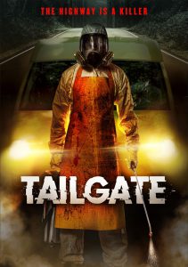
movie poster of road rage killer in hazmat suit holding poison

You could simply use “movie” for this image.  However, to provide more beneficial content for both business and consumer, we should describe the image as if someone were unable to see it. 

Your chosen text should be thorough, yet concise – typically 120 characters or less. 

When building the html for alt text, Img Src = image source, and the information within the quotation marks is the title of the image.  For our purposes, this is labeled the title of the movie.

  • Okay alt text: alt=”movie”>
  • Better alt text: alt=”cover art for horror movie”>
  • Best alt text: alt=”movie poster of road rage killer in hazmat suit holding poison”>

Put it all together and it looks like this: <img src=”/tailgate.jpeg” alt=”movie poster of road rage killer in hazmat suit holding poison” />

The great news is: Website platforms that allow you to add images (i.e.: Amazon, WordPress, HubSpot, etc.) have simple tools for you to add alt text to images without having to build html into your web code or prior to uploading your images. 

The first step is becoming familiar with the tools and functions of your specific platform to utilize these built-in capabilities.

If you are planning to add metadata to an image before uploading, it can be implemented at the time you save an image to your drive; therefore, image metadata will consistently be carried to whichever platform you choose. (Baked in, as it were!)

This can be achieved by a couple of methods:

  • Adding ALT text to image metadata on your PC (no special software required – free!)
  • Adding ALT text to image metadata using Adobe Bridge (subscription required)

Stay tuned to our blog for more tips and tricks to implement alt text and metadata in industry-leading ways to digital platforms!

And, as always, if you want to talk it out, send us a line at studios@ds.aent.com.
Copy That!

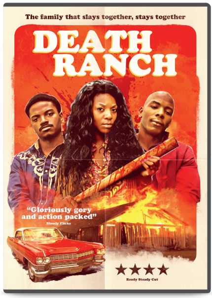
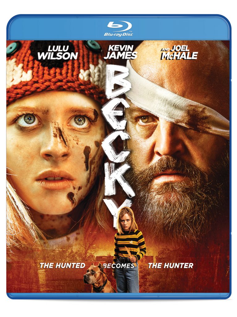
A DVD or Blu-ray on a shelf acts as a mini-billboard for itself. And just like that ginormous billboard hovering over the freeway, every single aspect of the artwork is intentional (and sometimes even legally required.)

When it comes to physical goods, a title has to speak quickly and clearly to potential purchasers. We aim to strike a balance between the rational and the emotional parts of the human brain, moving from “Hmmm, this looks like something I might like” to “Yes! (adds to cart)” in the space of a few seconds.

We gave the feedback, our partners at Quiver delivered!

At Distribution Solutions, marketing and design professionals are hard at work to blend art and commerce in a way that’s going to drive purchase intent…for the benefit of our label partners. Everyone wins if we get it right!

Striking imagery is the first thing that likely catches a consumer’s eye, but then the box copy gets right to work. Because we only have a few seconds with a customer in a store aisle in an Amazon search, each and every character of the text on a DVD or Blu-ray cover has to pull its weight.

Design provided by 4Digital; tagline and concept by Distribution Solutions.

At Distribution Solutions, whether we’re designing the art (or providing feedback), our partners know that each element we include (or suggest) supports the recommendations found during our SWOT analysis of the title.

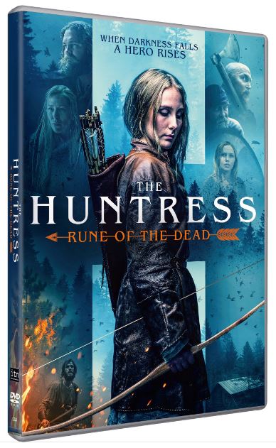
Collaborated concept: ITN Distribution and Distribution Solutions

If you’ve been out in the world and seen a DVD before, then you’ll know the key components of key art copy. But we’ll mention them here anyway so that we can elaborate on what each bit of copy brings to the table.

  • Title Treatment: Color, typeface, and design convey the film’s genre and tone. Great place to weave in genre iconography or go with a font that evokes a time period.
  • Tagline: Adds context and sells the premise of the film. This can be a difficult thing to write. Needs to be concise and as original as possible. (The DS team flat out loves tagline brainstorming, so our partners know they can count on us to get there!)
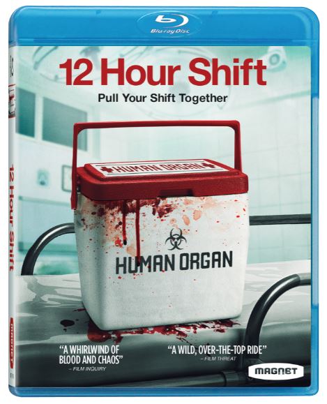
  • Press Quotes: Communicate the critical acclaim and serve as a hallmark of quality, while the sources contextualize who is recommending. With the right set of quotes, a tagline is rendered unnecessary. A great situation!

Our goal is to make the most out of the few seconds our label partners’ titles have with a potential purchaser, whether it be in the aisles of a big-box retailer or a digital storefront during an at-home browse.

Feedback from Distribution Solutions, final art delivered by Magnolia.

To learn more about our process and talk to us about the intersection of art and commerce, drop us a line at studios@ds.aent.com. And one more for the road…
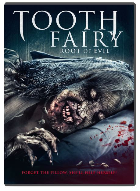
Horror and twisted humor go together like baby teeth and cash rewards. Design courtesy of ITN Distribution, with creative input from Distribution Solutions.

A+ Merchandising

This week, we’re focusing on maximizing consumer appeal on Amazon. Sweet, ubiquitous Amazon. A powerhouse in the online retail space, a hub for just about everything under the sun, Amazon is a behemoth in the retail space…with a seemingly endless parade of products. So many products, in fact, that “being there” just isn’t enough.

When a product is competing with millions of other similar items, it’s important to leverage every possible advantage.

How do we begin to make our partners’ products stand out? For this topic, we turn to our internal experts, Andrea Franco, Senior Account Manager, and Vera Martynets, Marketing Manager. Both are dedicated to our Amazon business and have put in countless hours setting up titles, managing inventory, and merchandising to appeal to consumers.

DS: Thanks for participating in this roundtable discussion! We’d like to focus today on one particular aspect of merchandising on Amazon: the A+ Page. For starters, what is an A+ page ?

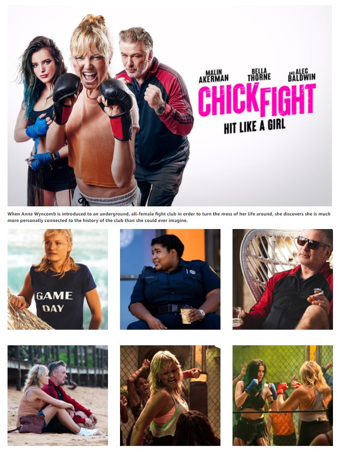
AF: A+ pages are Amazon product pages that go beyond the basic product details and offer online customers more information about a release. They can include additional images and product features that otherwise would not be seen.  

VM: Right, they allow you to add more descriptors to a product.

DS: More descriptors are important because…?

VM: With each additional image you get to program more keywords, which helps with the searchability of the product. More pictures = better appearance in search results.

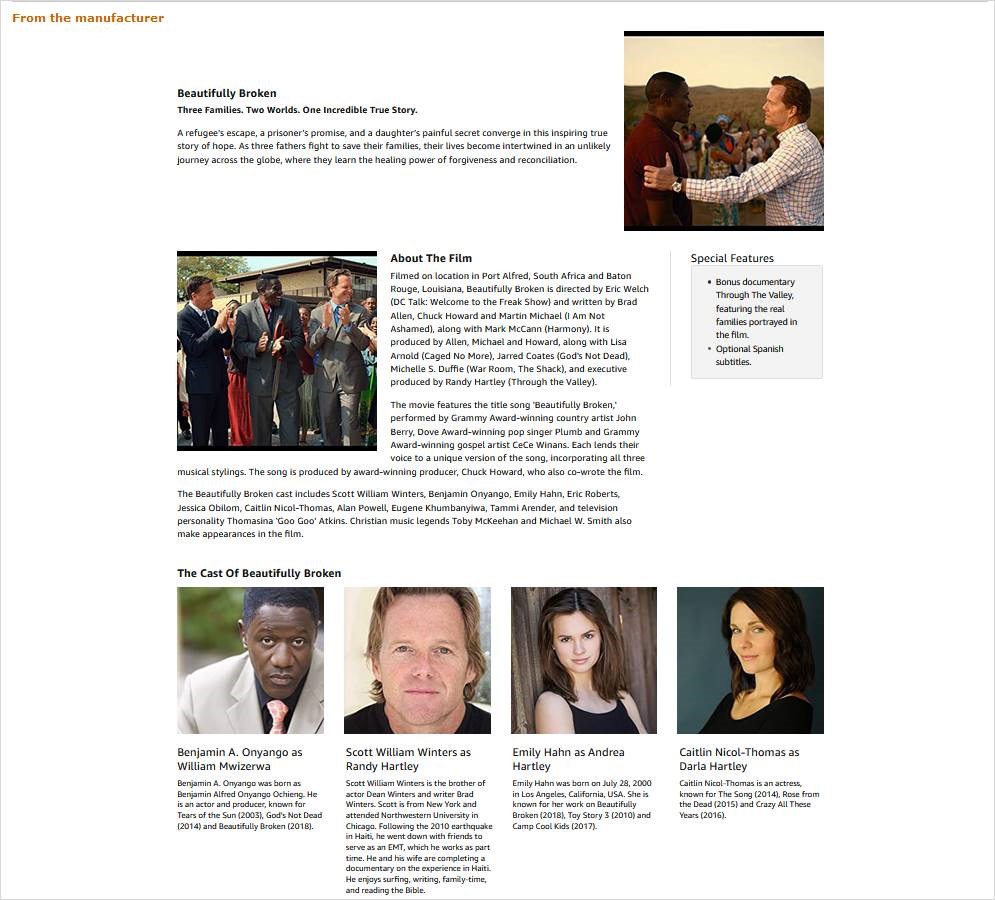
As you can see, this page lets consumers see exactly what the deluxe set includes!

DS: Okay, from a ‘consumer appeal’ and ‘searchability’ perspective, totally makes sense. Any other benefits?

VM: Adding a good-looking A+ page can result in higher conversion rates, increased traffic, and increased sales.

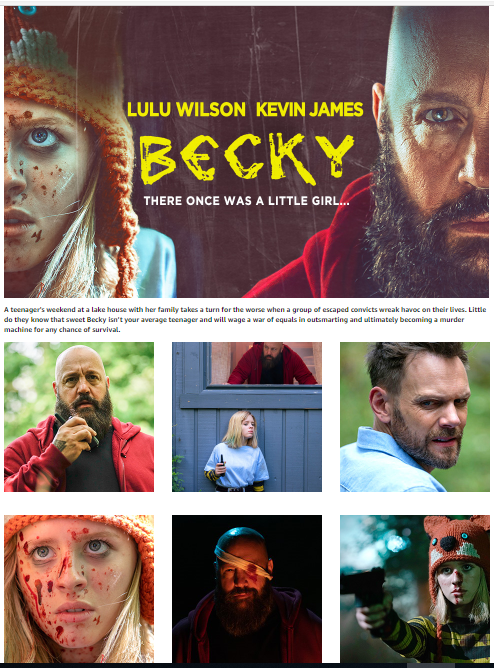
Loads of great keywords here!

AF: And it’s really a better way to engage the Amazon customer. An opportunity to tell them everything you want them to know about your release, like special features, Dove Approval rating, extensive cast. It’s a way to boost your release in search rankings without paying for sponsored ads.  It’s also an opportunity to optimize for mobile customers.

A closer look at Audrey, a documentary about this extraordinary actress, style icon and humanitarian.

DS: So this enhanced page can work on whole lotta levels, got it. What is the cost to our label partners?

VM: Zero, nada, zilch!

AF: That’s right: NOTHING!  This benefit adds value without costing a thin dime.

DS: Well, that’s great…so what do you need from label partners in order to create these awesome pages?

VM: Attractive synopsis, great stills. Photos showcasing talent, production value, storyline intrigue – anything that makes the movie look fantastic! And press reviews, critics’ shout-outs, awards…

AF: We call this EMC (Enhanced Marketing Content). The more photos the better, so I’ll add “beauty shots” of gift sets and talent headshots to Vera’s list. Oh – and expanded synopsis, special feature details. Detailing content by disc on multi-feature or box set products.

DS: Laughing a bit that we don’t escape this discussion without at least one new acronym…but what’s the dream scenario for EMC?

AF: The dream? At least one banner, lots of stills, full synopsis, and feature call-outs. That being said, a little bit can go a long way in making a polished, searchable product page that stands out from the crowd.

Clear photos featuring recognizable talent and a grabby banner to top them off!

DS: So, if I were to summarize our chat, I’d say key takeaways about the value of an A+ page are:

  1. Increases searchability (stand out from the competition)
  2. Adds consumer appeal (better sales tool)
  3. 100% customizable, based on available assets, no reason not to!

Thanks, Andrea and Vera. This has been a great discussion about the Amazon A+ page service we provide to our .com label partners Thank you both so much!

Readers, if you would like to learn more about our A+ page support and features, please reach out to us at studios@ds.aent.com for more information!